Project
Ed Walkthrough
Overview
Ed is HMH’s classroom platform for teachers and students. Teachers can perform many non-teaching tasks like manage class rosters, distribute assignments, and track student progress against state standards. Students logging into Ed can see what has been assigned to them, turn in assignments, access course materials, and view grades.
Challenge
I was brought on to work on the Ed Platform Teacher Walkthrough after the initial version didn’t do very well in its first user test. The version that was tested had a video segments with limited controls and fragile walkthroughs with no user interaction. When I say fragile, I mean that in the sense that if the teacher wasn’t selecting the exact right item, the walkthrough would get stuck and not be able to proceed. There was no avenue for recovery or undoing an incorrect selection and there was no hint as to what needed to be selected instead.
Summary

Role
Team Lead User Experience Designer for Walkthrough

Responsibilities
Lead UX design on agile team, Plan design sprints, Adapt existing designs, Run design reviews with the cross-functional team, Develop interactive prototypes, Assist researcher in assessing efficacy

Collaborators
User Researchers, UX Designers, Product Owners, Engineers

Deliverables
Interactive prototypes, Annotated designs
Approach
User Research Results Analysis
I identified the issues from the user test as being about purpose and discoverability. The purpose of on-screen Help can be muddied very easily. There were a lot of opinions internally as to what Help really meant. After some informal polling, I broke it into two parts: 1. New user orientation; and 2. FAQs and how-to’s for more experienced users with an immediate need.
Landing Page - Before
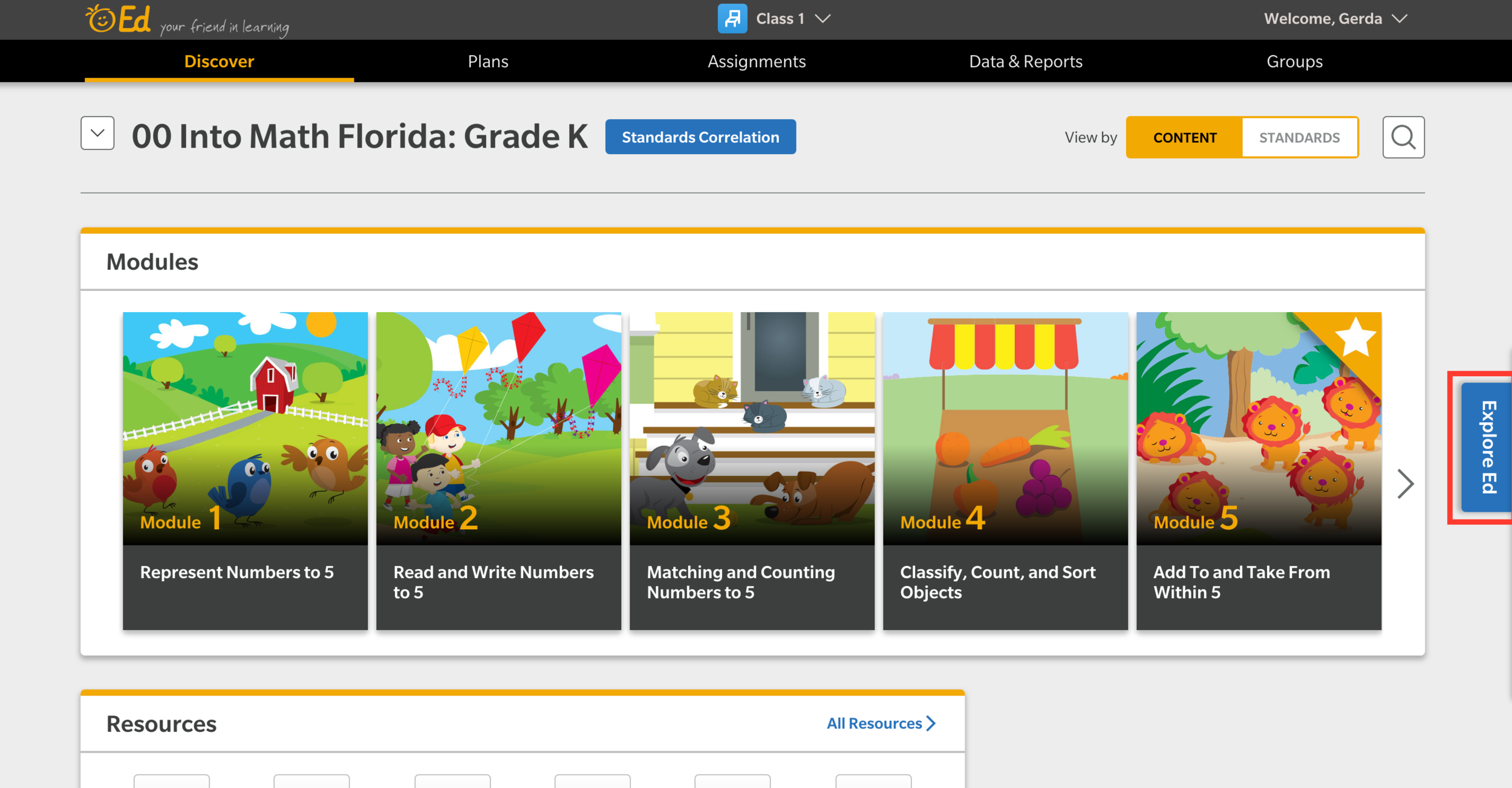
Help is relegated to a small tab on the far right which was hard to find.
Walkthrough - Before
The main avenue to instruct new users is through video that autoplays upon login.
Annotated Designs
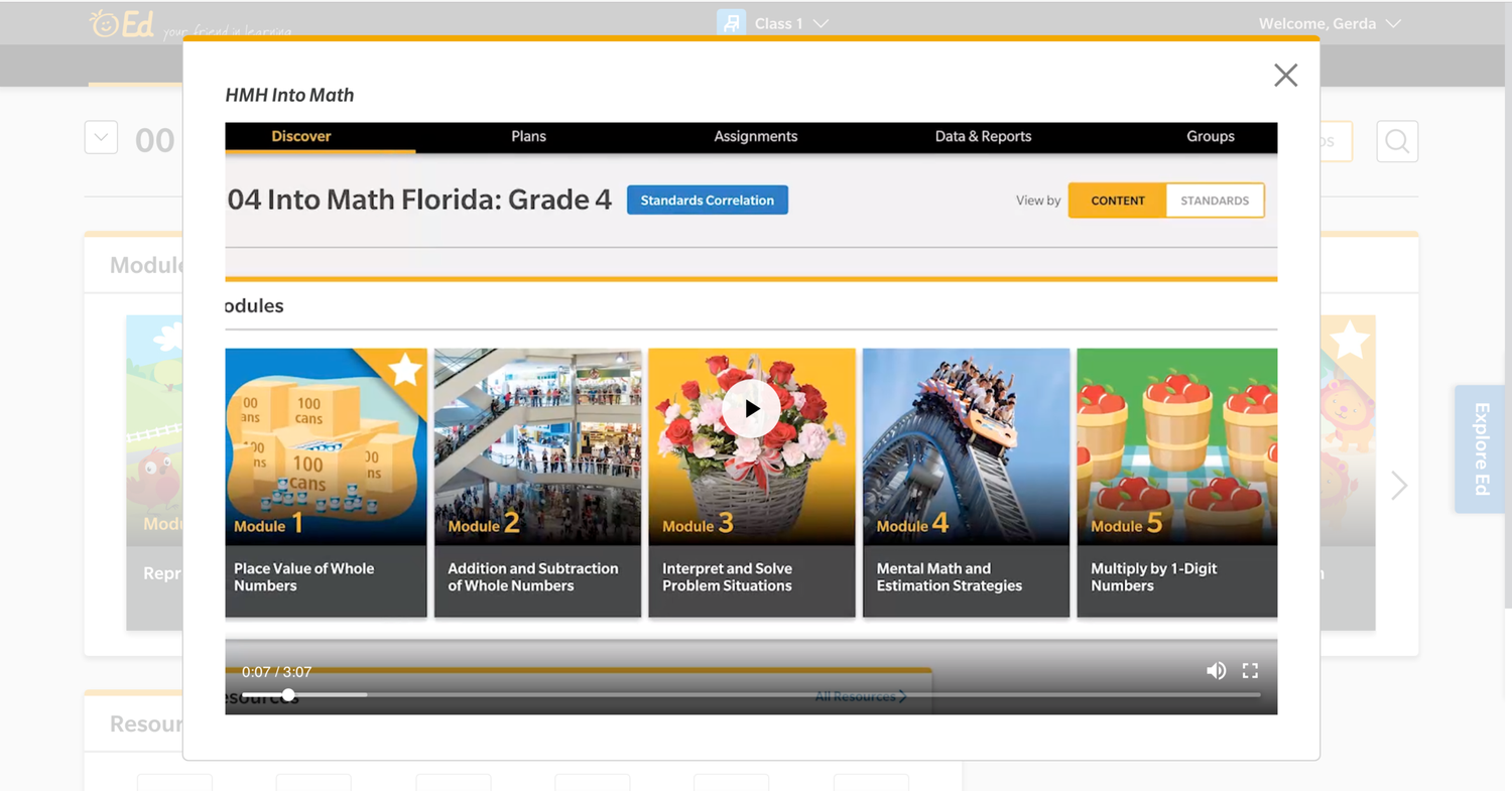
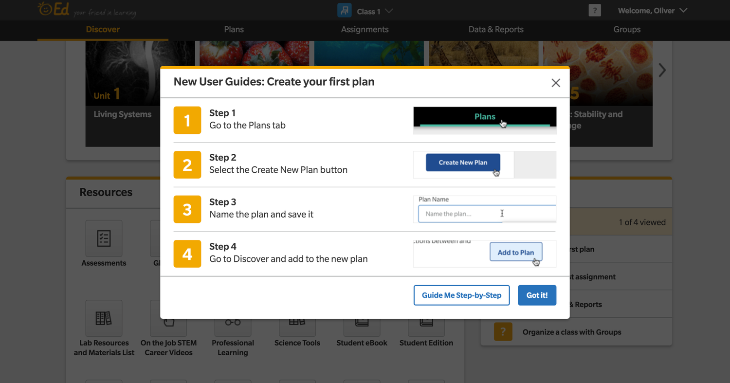
First, to address the needs of the new users, I looked back at the interviews to see how people wanted help. For those who wanted a quick reference, I designed an annotated sheet for common “rookie” actions. For those who wanted more in-depth guidance, the users were able to select the ‘Guide Me Step-by-Step’ button from the quick reference. The button launched a walkthrough in the style of a guided step-by-step tour around the platform that required user interaction to proceed.
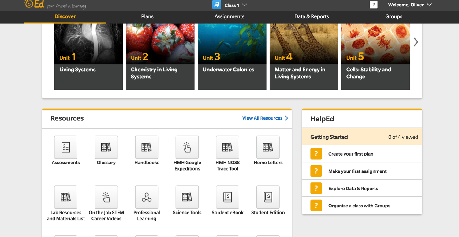
To handle the discoverability issue, I made it much easier to find Help by adding it to the main navigation bar. This help icon brought users to our in-house FAQ page and guides. The guides and walkthroughs for new users were also moved to a dedicated panel in the bottom right corner of the page.
Interactive Prototypes
After identifying the general issues, I made sketches and flows of how the new help would work. When I showed them to my fellow designers, it didn’t seem to click because the ideas were too abstract. I started converting my work into an Axure prototype which allowed continued iteration on the pages that would go back to user testing.
Landing Page - After
The purpose of the help and walkthroughs are now clear before a user selects an option.
Walkthrough - After
The option for a fully-guided step-by-step tour is still there but it is an option after seeing a picture-based guide summary.
Usability Testing
When inheriting another designers work, I always like to meet with the previous designer to discussion intention, blockers, and what needs to be unchanged. I then have a similar meeting with the engineering team to see if they can spot any issues for developement cycles. In this case, meeting with engineering revealed that several data points wouldn’t be available for the first iteration. I removed those from the design and let the product owner know so that it wouldn’t be a surprise and also so that it could be added to the backlog and prioritized appropriately.

Other Projects
View Project
→
View Project
→

Let’s Connect


CONTACT
480-414-7360
g.w.pouliot@gmail.comSOCIAL
Project
Ed Walkthrough
Overview
Ed is HMH’s classroom platform for teachers and students. Teachers can perform many non-teaching tasks like manage class rosters, distribute assignments, and track student progress against state standards. Students logging into Ed can see what has been assigned to them, turn in assignments, access course materials, and view grades.
Challenge
I was brought on to work on the Ed Platform Teacher Walkthrough after the initial version didn’t do very well in its first user test. The version that was tested had a video segments with limited controls and fragile walkthroughs with no user interaction. When I say fragile, I mean that in the sense that if the teacher wasn’t selecting the exact right item, the walkthrough would get stuck and not be able to proceed. There was no avenue for recovery or undoing an incorrect selection and there was no hint as to what needed to be selected instead.
Summary
Role
Team Lead User Experience Designer for Walkthrough
Responsibilities
Lead UX design on agile team, Plan design sprints, Adapt existing designs, Run design reviews with the cross-functional team, Develop interactive prototypes, Assist researcher in assessing efficacy
Collaborators
User Researchers, UX Designers, Product Owners, Engineers
Deliverables
Interactive prototypes, Annotated designs
Approach
User Research Results Analysis
I identified the issues from the user test as being about purpose and discoverability. The purpose of on-screen Help can be muddied very easily. There were a lot of opinions internally as to what Help really meant. After some informal polling, I broke it into two parts: 1. New user orientation; and 2. FAQs and how-to’s for more experienced users with an immediate need.
Landing Page - Before
Help is relegated to a small tab on the far right which was hard to find.
Walkthrough - Before
The main avenue to instruct new users is through video that autoplays upon login.
Annotated Designs
First, to address the needs of the new users, I looked back at the interviews to see how people wanted help. For those who wanted a quick reference, I designed an annotated sheet for common “rookie” actions. For those who wanted more in-depth guidance, the users were able to select the ‘Guide Me Step-by-Step’ button from the quick reference. The button launched a walkthrough in the style of a guided step-by-step tour around the platform that required user interaction to proceed.
To handle the discoverability issue, I made it much easier to find Help by adding it to the main navigation bar. This help icon brought users to our in-house FAQ page and guides. The guides and walkthroughs for new users were also moved to a dedicated panel in the bottom right corner of the page.
Interactive Prototypes
After identifying the general issues, I made sketches and flows of how the new help would work. When I showed them to my fellow designers, it didn’t seem to click because the ideas were too abstract. I started converting my work into an Axure prototype which allowed continued iteration on the pages that would go back to user testing.
Landing Page - After
The purpose of the help and walkthroughs are now clear before a user selects an option.
Walkthrough - After
The option for a fully-guided step-by-step tour is still there but it is an option after seeing a picture-based guide summary.
Usability Testing
When inheriting another designers work, I always like to meet with the previous designer to discussion intention, blockers, and what needs to be unchanged. I then have a similar meeting with the engineering team to see if they can spot any issues for developement cycles. In this case, meeting with engineering revealed that several data points wouldn’t be available for the first iteration. I removed those from the design and let the product owner know so that it wouldn’t be a surprise and also so that it could be added to the backlog and prioritized appropriately.

Other Projects
View Project
→
View Project
→

Let’s Connect

CONTACT
480-414-7360
g.w.pouliot@gmail.comSOCIAL
Project
Ed Walkthrough
Overview
Ed is HMH’s classroom platform for teachers and students. Teachers can perform many non-teaching tasks like manage class rosters, distribute assignments, and track student progress against state standards. Students logging into Ed can see what has been assigned to them, turn in assignments, access course materials, and view grades.
Challenge
I was brought on to work on the Ed Platform Teacher Walkthrough after the initial version didn’t do very well in its first user test. The version that was tested had a video segments with limited controls and fragile walkthroughs with no user interaction. When I say fragile, I mean that in the sense that if the teacher wasn’t selecting the exact right item, the walkthrough would get stuck and not be able to proceed. There was no avenue for recovery or undoing an incorrect selection and there was no hint as to what needed to be selected instead.
Summary
Role
Team Lead User Experience Designer for Walkthrough
Responsibilities
Lead UX design on agile team, Plan design sprints, Adapt existing designs, Run design reviews with the cross-functional team, Develop interactive prototypes, Assist researcher in assessing efficacy
Collaborators
User Researchers, UX Designers, Product Owners, Engineers
Deliverables
Interactive prototypes, Annotated designs
Approach
User Research Results Analysis
I identified the issues from the user test as being about purpose and discoverability. The purpose of on-screen Help can be muddied very easily. There were a lot of opinions internally as to what Help really meant. After some informal polling, I broke it into two parts: 1. New user orientation; and 2. FAQs and how-to’s for more experienced users with an immediate need.
Landing Page - Before
Help is relegated to a small tab on the far right which was hard to find.
Walkthrough - Before
The main avenue to instruct new users is through video that autoplays upon login.
Annotated Designs
First, to address the needs of the new users, I looked back at the interviews to see how people wanted help. For those who wanted a quick reference, I designed an annotated sheet for common “rookie” actions. For those who wanted more in-depth guidance, the users were able to select the ‘Guide Me Step-by-Step’ button from the quick reference. The button launched a walkthrough in the style of a guided step-by-step tour around the platform that required user interaction to proceed.
To handle the discoverability issue, I made it much easier to find Help by adding it to the main navigation bar. This help icon brought users to our in-house FAQ page and guides. The guides and walkthroughs for new users were also moved to a dedicated panel in the bottom right corner of the page.
Interactive Prototypes
After identifying the general issues, I made sketches and flows of how the new help would work. When I showed them to my fellow designers, it didn’t seem to click because the ideas were too abstract. I started converting my work into an Axure prototype which allowed continued iteration on the pages that would go back to user testing.
Landing Page - After
The purpose of the help and walkthroughs are now clear before a user selects an option.
Walkthrough - After
The option for a fully-guided step-by-step tour is still there but it is an option after seeing a picture-based guide summary.
Usability Testing
We re-tested the new designs with a mixture of new users and those who had seen the old version. It was a dramatic difference. Our teachers said that it was “cool”, “a delight”, and they felt like “they were in charge”. The new walkthroughs required more interaction out of the teachers but instead of feeling like it was more work, they told us this method was easier. We checked for understanding at the end of the testing sessions and with the new walkthroughs, the teachers remembered more about what they had learned about the system than was seen in previous tests.

Other Projects
View Project
→
View Project
→

Let’s Connect

CONTACT
480-414-7360
g.w.pouliot@gmail.comSOCIAL